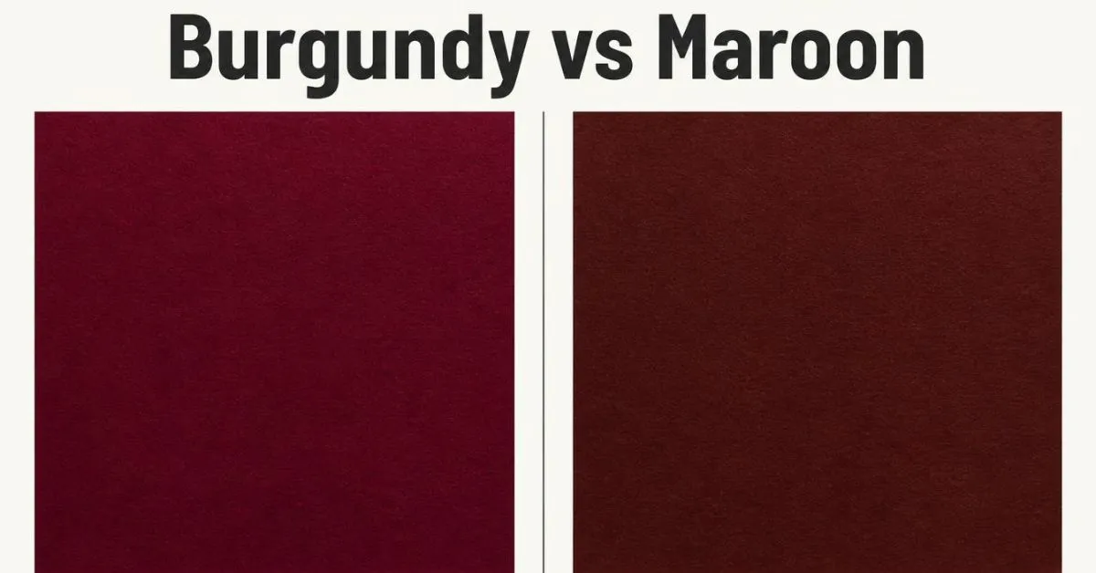
Burgundy vs maroon: Burgundy often looks like deep red wine, with purple or plum tones. Maroon often looks like a deep, earthy red. However, the two colors can look very similar.
Their exact shades depend on the color code, fabric, paint, or product. If you need an exact match, compare real samples or use the same digital color code.
Key Takeaways
- Burgundy: Often has a wine-red, purple, or plum tone.
- Maroon: Often has a deep red or brownish-red tone.
- Burgundy HEX code:
#800020is a common digital reference. - Maroon HEX code:
#800000is the standard CSS named color. - Darkness: Neither color is always darker than the other.
- Best way to compare: Check the actual shade under the same light.
What Is the Difference Between Burgundy & Maroon?
Burgundy and maroon are both dark shades of red. The main difference is their usual color tone.
Burgundy is linked to red wine. It often has a purple or plum tint. Maroon often has a warmer, earthy look, with brownish-red tones.
| Feature | Burgundy | Maroon |
|---|---|---|
| Main color | Deep red | Deep red |
| Common tone | Wine-like or purple | Earthy or brownish-red |
| Overall look | Rich and elegant | Warm and classic |
| Common uses | Dresses, decor, premium designs | Uniforms, sportswear, classic decor |
| Common digital reference | #800020 | #800000 |
| Best clue | Look for a wine-like tint | Look for an earthy red tint |
These differences are common, not strict rules. Some burgundy shades look brown, while some maroon shades look purple. The two names can also describe very similar colors.
The names have different origins, too. Burgundy takes its name from the Burgundy wine region of France. Maroon comes from the French word marron, meaning chestnut. These links help explain the common color associations, but they do not set exact color values.
Burgundy vs Maroon Color Codes
If you are making a website, logo, or digital design, color codes help you choose an exact shade.
A HEX code uses six letters or numbers to define a digital color. RGB stands for red, green, and blue. These three values describe how much of each color of light makes up the shade.
| Color detail | Burgundy reference | CSS maroon |
|---|---|---|
| HEX | #800020 | #800000 |
| RGB | 128, 0, 32 | 128, 0, 0 |
| Red value | 128 | 128 |
| Green value | 0 | 0 |
| Blue value | 32 | 0 |
The code #800000 is the standard named color maroon in CSS, the language used to style web pages. The code #800020 is a common digital reference for burgundy, not a universal standard for every burgundy product.
The two codes share the same red and green values. The burgundy reference has a blue value of 32, while CSS maroon has a blue value of zero. This small change gives the colors a different appearance.
Which code should you use?
- Use
#800020if you want this common burgundy reference. - Use
#800000if you want the standard CSS maroon color. - Use an approved brand code if you are matching an existing design.
- Use real samples when choosing paint, fabric, or printed materials.
Remember that a color name does not always point to one exact code. A clothing brand may sell a burgundy shade that looks different from this digital reference.
What Does Burgundy Look Like?
Burgundy is a deep red that often looks like red wine. Depending on the shade, it may have purple, plum, or brown tones.
It can give an outfit or room a rich, formal look without using a bright red.
You may see burgundy in:
- Dresses, suits, and blazers
- Handbags, shoes, and scarves
- Curtains, cushions, and sofa fabrics
- Wedding flowers and decorations
- Logos and premium product packaging
Burgundy pairs well with cream, charcoal gray, gold, and navy. Cream makes it feel softer, while charcoal gives it a deeper, more dramatic look.
Not every burgundy shade looks purple. Some versions lean toward brown or deep red. If you are matching it with another color, judge the actual shade rather than relying on its name.
What Does Maroon Look Like?
Maroon is a deep red that often has a warm, earthy look. Some shades appear brownish-red, while others look closer to pure dark red.
Maroon is common in:
- School and university uniforms
- Sports team colors
- Sweaters, jackets, and blazers
- Traditional home decor
- Logos and official designs
Maroon works well with beige, cream, gray, navy, and olive green. These colors can balance its deep red tone and create a classic look.
If you compare a maroon shirt with a burgundy shirt, look for the color tone, not just how dark each shirt appears. A wine-like shade may look more like burgundy, while an earthy red may look more like maroon.
Still, the label is not proof of the exact shade. Two brands can use the same color name for different colors.
Is Burgundy Darker Than Maroon?
No. Burgundy is not always darker than maroon.
The answer depends on the exact shades you compare. A dark burgundy can look deeper than a lighter maroon. A very dark maroon can also look deeper than a lighter burgundy.
It helps to separate two ideas:
- Hue: The type of color you see, such as red, purple, or blue.
- Lightness: How light or dark a color looks.
A purple tint does not automatically make a color darker. In the same way, a brownish tint does not always make it lighter.
The reference colors #800020 and #800000 are close in appearance, but they are not identical. Their codes show a difference in blue content. They do not mean that every burgundy shade is darker or lighter than every maroon shade.
When comparing clothes or paint, place the samples side by side under the same light. This gives you a better comparison than the names alone.
Burgundy vs Maroon: Which One Should You Choose?
The right choice depends on where you plan to use the color and the look you want.
Clothing & Fashion
Choose burgundy if you like a wine-like red for a dress, blazer, handbag, or pair of shoes.
Choose maroon if you prefer a warm, earthy red for a sweater, jacket, or everyday outfit.
For example, a burgundy dress with black shoes can create a formal look. A maroon sweater with beige pants can feel warm and relaxed.
When shopping online, check customer photos and product details. Screen images may not show the true shade. If matching a suit, dress, or accessory matters, compare the items in person when possible.
Makeup & Hair Color
Burgundy and maroon appear in lipstick, hair dye, and other beauty products. Burgundy shades often lean toward wine or plum, while maroon shades may look warmer or more brownish-red.
However, brands do not always use these names in the same way.
For lipstick, test the shade on your lips if possible. For hair dye, check the brand’s shade chart and instructions. Your starting hair color can change the final result.
Your skin tone may help you choose a shade, but there is no single rule that works for everyone. Compare both colors near your face and choose the look you prefer.
Home Decor & Paint
Burgundy can add a rich touch to cushions, curtains, accent chairs, or a feature wall. Maroon can work well with wood, beige furniture, and warm neutral colors.
Before painting a wall, test a sample on the surface. Check it in daylight, in the evening, and under your usual lamps. A color can look different as the light changes.
Also, remember that paint may look different on a large wall than it does on a small sample. Test the shade in the room where you plan to use it before buying all the paint.
Graphic Design & Printing
Burgundy can suit formal invitations, wine-inspired designs, and premium packaging. Maroon can work well for sports graphics, school designs, and classic logos.
For websites, use HEX or RGB values to keep your digital colors consistent. For printed work, ask your printer about CMYK values or a Pantone color match.
Screens create colors with light, while printers use ink. As a result, a color on your monitor may not look exactly the same on paper.
If you are building a brand, save the approved color values and a printed sample. Use them as a reference for future designs.
What Colors Go With Burgundy & Maroon?
Both colors work well with neutral shades. Your best match depends on whether you want a soft, warm, classic, or bold look.
| Pairing color | With burgundy | With maroon |
|---|---|---|
| Cream | Soft and elegant | Warm and balanced |
| Gold | Rich and formal | Classic and bold |
| Black | Deep and dramatic | Strong and simple |
| Beige | Softens the wine-red tone | Supports the earthy look |
| Navy | Rich and polished | Classic and calm |
| Forest green | Deep seasonal contrast | Warm, natural contrast |
| Light gray | Clean and modern | Soft and balanced |
| Dusty pink | Gentle contrast | Warm, subtle contrast |
For an easy starting point, pair burgundy with cream or charcoal gray. Pair maroon with beige or navy.
You can also wear or use burgundy and maroon together. Since they are close in color, choose shades with a clear difference in tone or texture. Add cream, black, or beige if the two reds look too similar.
These pairings are suggestions, not fixed rules. Try a small sample or test an outfit before making a final choice.
How to Tell Burgundy From Maroon
Use these steps when the two shades look almost the same.
- Place them side by side. Comparing two colors at the same time is easier than judging each one from memory.
- Look at the tone. Burgundy often looks wine-like or purple. Maroon often looks earthy or brownish-red.
- Check the color code. If you are comparing digital colors, use HEX or RGB values instead of relying on the names.
- Test the real material. Fabric, paint, and printed colors may look different from a screen image.
- Check the lighting. Compare the colors in daylight and under the light where you plan to use them.
For online shopping, look at more than one product photo. For paint, test a sample on the wall. For graphic design, save the exact code you choose.
The best method depends on the material, but the goal is the same: compare the actual shades rather than trusting the label alone.
FAQs:
Are burgundy and maroon the same color?
No, but their shades can overlap. Burgundy often has a wine-red or purple tone, while maroon often has an earthy or brownish-red look. These are common differences, not strict definitions. The actual shade matters more when you need an exact match.
Which color has purple undertones?
Burgundy is more often linked to purple or plum tones. The common reference #800020 also contains more blue than CSS maroon, #800000. However, not every burgundy shade looks purple.
Which color looks more brown?
Maroon often looks more brownish-red than burgundy. Still, some burgundy shades have brown tones, too. The exact color depends on the product and the way it appears under different lights.
What are the HEX codes for burgundy and maroon?
A common burgundy reference is #800020. The standard CSS maroon code is #800000. These codes are useful for digital design, but they do not define every shade sold under those names.
Can you wear burgundy and maroon together?
Yes. Both colors belong to the dark red family, so they can work well together. Choose shades with a clear difference in tone or texture. Cream, beige, or black can help balance the look.
Which color is better for clothes?
Neither color is always better. Burgundy may suit you if you prefer a wine-like red, while maroon may appeal to you if you like an earthy red. Compare both shades with your outfit and under natural light.
Do burgundy and maroon look different in sunlight?
They can. Sunlight, indoor lighting, fabric texture, and screen settings can all affect how a color appears. Compare real samples under the light where you plan to wear or use them.
Conclusion:
The main difference between burgundy and maroon is their usual tone. Burgundy often looks like deep red wine with a purple or plum tint, while maroon often looks like an earthy, brownish-red.
Choose burgundy for a wine-like look and maroon for a warmer, classic style. Neither color is always darker than the other, and the names do not guarantee an exact shade.
The simplest rule: Look for the wine-like tone in burgundy and the earthy red tone in maroon. When an exact match matters, use a color code or compare real samples instead of relying on the name alone.

Harry Jack is a content writer at ReplyGenius.com who specializes in practical, natural sounding replies for texts, social media, relationships, and everyday conversations.