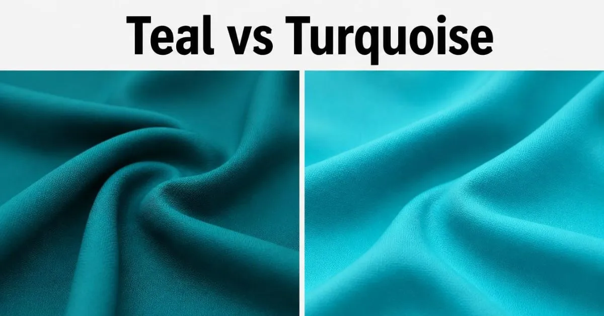
Teal vs turquoise comes down to their typical shade and appearance. Teal is often a deeper blue-green, while turquoise is usually brighter and more vivid. The standard web color for teal is #008080, while turquoise is #40E0D0.
However, these names cover many shades in paint, clothing, and decor. To choose the right one, compare the actual colors, not just their names.
Key Takeaways
- Teal: Usually looks deep, rich, and blue-green.
- Turquoise: Often looks brighter and more vivid, with a fresh blue-green tone.
- Color codes: Standard HEX codes identify exact digital colors.
- Home and fashion: Both colors work well, but the best choice depends on the shade and setting.
- Best way to choose: Compare samples in the light where you will use them.
What Is the Difference Between Teal & Turquoise?
Teal and turquoise belong to the same broad color family. Both combine blue and green, but they often have a different look.
Teal usually appears deeper and darker. It can add a rich, calm feel to a room, outfit, or website.
Turquoise often looks brighter and more vivid. Many people link it to tropical water, bright skies, and blue-green gemstones.
The key difference is typical appearance, not a strict rule for every shade.
| Feature | Teal | Turquoise |
|---|---|---|
| Color family | Blue-green | Blue-green |
| Common appearance | Deep and rich | Bright and vivid |
| Lightness | Often darker | Often lighter |
| Visual feel | Calm and bold | Fresh and lively |
| Home decor | Sofas, cabinets, accent walls | Cushions, artwork, small accents |
| Clothing | Jackets, dresses, formal outfits | Summer wear, scarves, jewelry |
| Digital design | Headers, backgrounds, buttons | Highlights, icons, accents |
| Standard web HEX | #008080 | #40E0D0 |
These descriptions are general guides. A pale teal may look lighter than a dark turquoise. Some shades can also look almost the same.
Why Can Teal & Turquoise Look Similar?
Color has more than one feature.
Three useful terms can help you compare shades:
- Hue: The basic color family, such as blue, green, or blue-green.
- Lightness: How light or dark a color looks.
- Saturation: How strong or muted a color looks.
Teal and turquoise can share a similar hue but differ in lightness and saturation. That is why one teal can look soft and pale, while another looks deep and bold.
The surface and lighting also matter. A glossy turquoise object may look brighter than a matte teal object, even if their colors are closer than they seem.
Teal vs Turquoise Color Codes
Color codes help you choose an exact shade for a website, logo, app, or digital image.
The standard CSS color names have these values:
| Color detail | Teal | Turquoise |
|---|---|---|
| HEX code | #008080 | #40E0D0 |
| RGB value | 0, 128, 128 | 64, 224, 208 |
| Red value | 0 | 64 |
| Green value | 128 | 224 |
| Blue value | 128 | 208 |
What Do HEX & RGB Mean?
HEX and RGB are two ways to describe a digital color.
A HEX code starts with a hash sign and uses six letters or numbers. Each pair represents red, green, or blue.
RGB uses three numbers, each from 0 to 255:
- The first number represents red.
- The second number represents green.
- The third number represents blue.
For example, teal uses 0, 128, 128. Its red value is zero, while its green and blue values are equal.
Turquoise uses 64, 224, 208. It contains more green and blue, along with some red.
These values describe the colors in the standard sRGB system used by CSS. They do not define every shade that a paint, clothing, or furniture brand may call teal or turquoise.
A screen can also display a color differently because of its settings and display technology. Printed colors may change with the ink, paper, and printing process.
Teal and Turquoise Color Swatches
Use these codes to preview the standard web colors.
- Teal:
#008080 - Turquoise:
#40E0D0
For a website, enter the code into your design tool or CSS. For paint or fabric, use a real sample to find the closest match.
How to Tell Teal & Turquoise Apart
Use these five steps when comparing two shades.
- Compare their lightness. Teal often looks darker, while turquoise often looks brighter.
- Place them side by side. Two colors can look alike on their own but different when viewed together.
- Check their blue and green tones. Some turquoise shades look more blue, while others look greener. Teal can also vary.
- Look at the surface. Glossy finishes reflect more light and may look brighter. Matte finishes often look softer.
- Check the lighting. Daylight, warm bulbs, and cool bulbs can change how a color appears.
Do not rely on the product name alone. If you are buying paint, fabric, furniture, or clothing, check the actual sample before making your choice.
Teal vs Turquoise vs Aqua vs Cyan
Teal, turquoise, aqua, and cyan are related colors, but their standard web values are different in some cases.
| Color | Standard HEX | General appearance |
|---|---|---|
| Teal | #008080 | Deep blue-green |
| Turquoise | #40E0D0 | Bright blue-green |
| Aqua | #00FFFF | Bright cyan |
| Cyan | #00FFFF | Bright cyan |
In CSS, aqua and cyan have the same exact color value. Turquoise has a separate value, and teal is darker than these colors in this comparison.
In everyday use, however, aqua and cyan may refer to broader groups of shades. Paint, fashion, and art brands may use these names in different ways.
If you need an exact digital match, use the HEX code. If you need to match a physical item, compare samples instead.
Where Should You Use Teal & Turquoise?
The best color depends on the effect you want. Think about the room, material, lighting, and other colors around it.
Home Decor & Paint
Teal works well when you want a rich color with strong depth. It can suit sofas, curtains, kitchen cabinets, accent walls, and other large items.
Try these teal pairings:
- Cream: Creates a warm, balanced look.
- Gold: Adds a rich accent.
- Light gray: Gives a clean, modern feel.
- White: Creates a clear contrast.
Turquoise can add a brighter touch to a room. It works well on cushions, artwork, lamps, bathroom details, and feature walls.
Try these turquoise pairings:
- White: Creates a fresh look.
- Beige or sand: Gives a coastal feel.
- Coral: Adds a bold contrast.
- Natural wood: Balances the bright color with warmth.
A light turquoise may help a room feel more open, while dark teal can add depth. But neither color is always the better choice. The result depends on the exact shade, the amount of natural light, and the other colors in the room.
Before buying paint: Test a sample on the wall. Check it in daylight and at night, and look at it next to your floor, furniture, and curtains.
Clothing & Accessories
Teal often suits outfits that need a deep, rich color. You can use it for dresses, jackets, shirts, shoes, and bags.
It pairs well with cream, black, gray, and gold.
Turquoise can add a bright touch to casual outfits, summer clothes, scarves, and jewelry. It often pairs well with white, denim, tan, and neutral shades.
Neither color belongs to one season. A dark turquoise may work well in a formal outfit, while a light teal may suit a relaxed look.
If you are buying turquoise jewelry, remember that the gemstone does not have one fixed shade. Natural turquoise can range from blue to green and may have dark or brown markings.
Websites & Branding
Teal can work well for headings, buttons, logos, and backgrounds. Turquoise can help highlight icons, links, illustrations, and small design details.
For example, a travel website could use teal for its main header and turquoise for selected icons. A wellness brand could use either shade, depending on its style and audience.
However, color choice is not only about looks. Text must be easy to read against its background.
The W3C Web Content Accessibility Guidelines (WCAG) set a minimum contrast ratio of 4.5:1 for normal text and 3:1 for large text at Level AA. Test the exact text and background colors before publishing your site. A color that looks bright may still be hard to read against white.
What Colors Go With Teal & Turquoise?
Both colors pair well with neutral shades. You can also combine them for a layered blue-green design.
| Color pairing | Best use |
|---|---|
| Teal + cream | Warm rooms and soft contrast |
| Teal + gold | Rich decor and formal designs |
| Teal + gray | Modern rooms and clean layouts |
| Turquoise + white | Bright, fresh designs |
| Turquoise + coral | Bold accents and summer styles |
| Turquoise + beige | Coastal decor and natural looks |
| Teal + turquoise + white | Balanced blue-green designs |
A simple way to build a color scheme is to choose one main color, one supporting color, and one accent color.
For example, use teal on a sofa, cream on the walls, and turquoise on a few cushions. On a website, use teal for the header, white for the main background, and turquoise for selected icons.
This keeps the colors balanced and gives each one a clear role.
Common Mistakes When Choosing Teal or Turquoise
Assuming teal is always darker
The standard web color for teal is darker than the standard web color for turquoise. But paint and clothing shades vary. A light teal can look brighter than a dark turquoise.
Trusting the color name alone
A brand may call a shade teal or turquoise without using the standard web value. Check the sample, product details, or color code before buying.
Ignoring lighting
A color may look different in daylight and under indoor bulbs. Check the shade where you plan to use it.
Using too many bright colors
Teal and turquoise can work together, but several strong colors may compete for attention. Add a neutral shade, such as cream, white, or beige, to balance the design.
Choosing text colors by looks alone
Turquoise may look attractive on a white background but still be hard to read. Check the contrast ratio before using it for text.
FAQs:
Are teal and turquoise the same color?
No. Both belong to the blue-green family, but teal often looks deeper and turquoise often looks brighter. Their shades can overlap, so the names alone do not always tell you how a physical product will look.
Is teal darker than turquoise?
The standard CSS color teal is darker than the standard CSS color turquoise. However, this is not a rule for every paint, fabric, or fashion shade. Always compare the actual colors.
Is teal more blue or green?
Teal is a blue-green color. Its exact appearance depends on the shade. The standard web color uses equal red-free amounts of green and blue, while other teal shades may lean more toward blue or green.
Does turquoise lean more blue or green?
Turquoise can lean toward either blue or green. Many turquoise shades look like bright blue-green, but natural turquoise gemstones vary in color. The exact shade depends on the material or color standard.
Can you use teal and turquoise together?
Yes. Use one as the main color and the other as an accent. For example, pair a teal sofa with turquoise cushions, or use a teal website header with turquoise icons. Cream and white can help balance both colors.
Which color is better for a small room?
Neither color is always better. A light turquoise may help a room feel brighter, while teal can add depth when used on a small wall or as an accent. Test samples in the room before choosing.
Which color should I choose?
Choose teal if you want a deeper blue-green look. Choose turquoise if you want a brighter, more vivid look. For digital designs, use the standard HEX codes. For paint, clothing, and furniture, compare real samples.
Conclusion:
The main difference between teal and turquoise is their typical appearance. Teal often looks deeper and darker, while turquoise usually looks brighter and more vivid.
Choose teal for rich accents, deep color schemes, and bold designs. Choose turquoise for bright details, fresh decor, and lively color combinations.
If you need an exact digital shade, use a HEX code. If you are choosing a physical product, check the real color in the light where you will use it. That is the best way to find the shade you want.

Harry Jack is a content writer at ReplyGenius.com who specializes in practical, natural sounding replies for texts, social media, relationships, and everyday conversations.